Introduction
In modern web and app development, user interfaces (UIs) have become more complex and critical to the overall user experience. This increasing complexity calls for efficient tools that help developers create, manage, and test UI components. One of the most powerful tools in this space is Storybook, an open-source tool that allows developers to build, organize, and test UI components in isolation.
In this article, we’ll dive into what Storybook is, its key features, and how it can help streamline the development of UIs, improve collaboration across teams, and enhance the overall quality of your product.
What is Storybook?
Storybook is a development environment for UI components. It enables developers to create components in isolation, test them in various states, and showcase them in a structured format. By providing a sandbox where components can be worked on individually, Storybook eliminates the need to run entire applications just to develop a single component.
Whether you’re working with React, Angular, Vue, or other frameworks, Storybook offers broad compatibility, making it a go-to tool for UI component development.
Key Features of Storybook
1. Component Isolation
Storybook allows developers to focus on building individual components without the overhead of the entire app. This isolation helps ensure that each component is well-constructed and works as intended before being integrated into a larger project.
2. Interactive Component Previews
With Storybook, you can preview components in real-time as you develop them. It provides a visual representation of how components look and behave in different states (such as hover, active, or disabled), allowing for faster debugging and refinement.
3. Stories and Story Format
Storybook organizes components into “stories,” which represent the various states and use cases for a given component. A story defines how a component should behave with certain props or inputs, making it easier to test and document component behavior.
4. Live Reload and Hot Module Replacement
As you make changes to your components, Storybook instantly reloads them, allowing you to see the updates immediately. This live feedback loop accelerates the development process, helping developers iterate faster.
5. Extensive Add-ons
Storybook supports a wide range of add-ons to extend its functionality. These add-ons provide features like accessibility testing, automatic documentation generation, viewport management (to simulate different devices), and more. The flexibility of add-ons makes Storybook a highly customizable tool that fits various needs.
6. Documentation and Collaboration
One of Storybook’s strongest points is its ability to generate documentation as you build components. This documentation is useful not only for developers but also for designers and stakeholders, as it clearly shows how each component behaves and interacts. This fosters better collaboration between developers, designers, and product managers.
Why Use Storybook?
1. Improved Collaboration
Storybook bridges the gap between development and design. With a live, interactive environment, designers can see how their designs are being implemented, and product managers can give immediate feedback. This shared understanding improves collaboration across the team.
2. Faster Development Cycles
By allowing developers to work on components in isolation, Storybook speeds up the development process. It eliminates the need to navigate through an entire application just to test or debug a single component, leading to quicker iterations and faster development cycles.
3. Component Reusability
Storybook promotes reusability by creating a single source of truth for your UI components. With components well-documented and organized, they can be easily reused across different projects or features, saving time and ensuring consistency in design.
4. Visual Testing
With Storybook’s ability to showcase components in different states, it’s easier to perform visual testing. You can quickly spot inconsistencies in design or behavior across different scenarios. Integrating with add-ons like Chromatic also allows for automated visual regression testing to catch unintended changes.
5. Enhancing Code Quality
Storybook makes it easier to test the functionality of individual components. Testing in isolation helps reduce bugs, and tools like Storybook Testing Library allow for seamless integration of unit tests. This leads to higher-quality code and more reliable components.
How to Get Started with Storybook
Setting up Storybook is straightforward. Here’s a basic guide to get started:
- Install Storybook: Use
npxto add Storybook to your existing project with the following command:
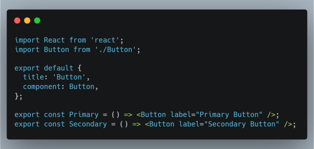
- Create Stories: Once installed, you can start creating stories for your components. A simple story for a button component in React might look like this:

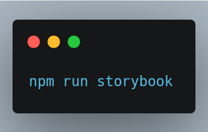
- Run Storybook: You can run Storybook using:

This will open Storybook in your browser, where you can view and interact with your components.
Conclusion
Storybook is an invaluable tool for modern UI development. By offering an isolated environment to build, test, and document components, it enhances the development process, improves collaboration, and ensures a higher quality of the final product. If you’re looking for a way to streamline your UI development workflow, reduce bugs, and foster better communication across your team, Storybook is an excellent choice.
At TechVraksh, we rely on Storybook to deliver top-notch UI components, ensuring that our clients receive visually consistent and fully functional digital products. Whether you’re a startup or an enterprise, Storybook can transform how you approach component development and design.
Are you ready to supercharge your UI development process? Reach out to us to learn more about how we can help you implement best practices using Storybook in your projects.
#Storybook #UIComponents #WebDevelopment #UIUX #TechVraksh #FrontendDevelopment #ComponentBasedDevelopment #Collaboration #DesignSystem
